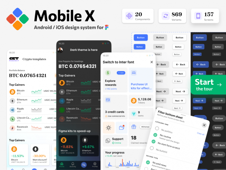
20 components, 869 variants, 157 mobile app templates
Mobile-X Figma design system is a cross-compatible & stylish UI kit that fits both iOS / Android apps. Based on iOS specs adopted to 8dp grid. Contains a huge collection of hi-end components with Auto-layout, styled into dark & light themes via Variants. Based on OFL fonts which are easy to swap in Figma: Brygada, Commissioner, Inter, Poppins, Manrope.
Highlights:
- 20 components with 869 variants. Buttons, Inputs, Lists, App bars / Headers, Tab bars / Navigation, Segmented tabs, Calendars, Timepickers, Popovers / Drawers, Charts, Cards, Tables, Snackbars, Sliders, Tooltips, Widgets, Switches, Rating stars and etc. ↔ Auto-layout supported.
- 150+ detailed app templates. Cards, Charts, Date & Time, Dashboards, Data grids, Inputs, Drawers, List items, Product details, Player, Popover menus, Settings, Selection, Start screen ✍ Named, Organized, Dark & Light.
- Fits for Android / iOS / web apps. This kit fits any mobile OS. Based on iOS specs adopted for the 8dp Android grid. No more strange 5, 7, 11, etc. paddings. Fits for Flutter development.
- Dark & Light themes considered. Use Figma’s Variants to swap components into the night mode. Each template supported by instance restyled into a dark theme. Modify master screen, then detach, if necessary.


![[Setproduct] Material X UI kit](https://designpro.me/wp-content/uploads/2022/02/Screenshot-2022-02-27-at-17.25.11-120x86.png)

![UI Design Handbook 🇺🇸 [epub]](https://designpro.me/wp-content/uploads/2022/03/Screenshot-2022-03-05-at-15.48.38-120x86.png)

